the first theme is quite harsh to my eyes. Because of my eyes’ weakness. I cannot read white texts on a very black background. ![]()
3 Likes
I don’t like the default dark mode
Ah okay! But I like the first one second one i think doesn’t have a right color scheme
3 Likes
i don’t also like the original theme, I like the second theme’s dark background it’s just the right color but the green color scheme is kinda not good, I prefer the blue one from the original.
5 Likes
Second one is the original dark version 1st one is the one i like ![]()
3 Likes
The first one makes my eyes hurt it is way to dark lol, I prefer a more grayish and darkish color like Discord’s
6 Likes
![]() But i will prefer #333 and #222 color scheme with blue buttons.
But i will prefer #333 and #222 color scheme with blue buttons.
5 Likes
I don’t like green either. It’s weird color. Instead i color it blue with Inspect Element
5 Likes
I like pink, just like my profile pic ![]()
5 Likes
I like Blue. It’s kinda relaxing like that:

5 Likes
too light blue hurts my eyes so bad…
i prefer darkish colors with light transparency…
5 Likes
Pink is a masculine color if you don’t mind ![]()
4 Likes
![]()
5 Likes
It’s yellow.
Weird things are going on with categories…
5 Likes
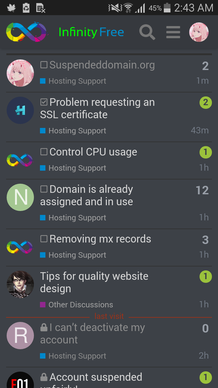
yes, changes have been made to the forum in the last three days
8 Likes
I dunno why I couldn’t see any ads only in the forum. This was also happened to me back then.
I don’t have any ad-blocker either.
3 Likes
Belated pride flag:

![]()
5 Likes
Well…looks very…cute ! ![]()
Not only that but is mentioned in TOS

You see ADS, but these are special new ones which we test,
and they “hypnotize” you !
So that after you are convinced that they do not exist ![]()
Something like your brain make your nose disappear when you look at something.
8 Likes
Lol, that is definitely not mine ![]()
I mean it is mine but with your editing
Modified version ![]()
7 Likes
You can’t hide - interesting how they tracked every communication (from the offenders) and discovered them
6 Likes