There used to be a rainbow logo with InfinityFree, why was it changed to the purple one?
Admin decided to rebrand back then, probably because the old one doesn’t feel so professional.
Two years ago, the website and branding was revamped to go from blue and green to purple. The logo was updated to match. The current one is a bit more professional indeed.
From a graphic design perspective the “new” logo is a lot cleaner and easier to look at. Plus, at the moment rainbow logos are everywhere online, so being different stands out a bit
It’s interesting though that I asked two designers to come up with a new design, and they both - independently from each other - decided that purple was the color to go for instead of blue and green.
Around the same time, another company I frequently engage with also changes their branding from blue and green to purple. And I know that at least one of the designers doesn’t know of my relation with that company.
So I’d say the color change really followed a fashion trend.
Interesting. Clearly purple is becoming popular too then
Makes sense, I guess it does seem more professional in the sense of “we mean business” instead of “we are a low-quality bad service” lol, but I do think the purple also looks nice.
I think that the choice of purple in both cases is more a case of both people reading design portals where it is stated what the trend is for each year including colors (the easiest way to make a design and play it safe).
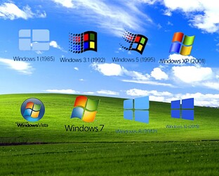
Another thing that could play a subliminal role is the Microsoft windows logo
whose colors were similar to the IF ex logo…
and how MS has changed his over the years to some form of blue purple,
so maybe someone reasoned after seeing the old IF logo and main 3 colors, and the idea came from his subconscious, and the “newer” MS logo appeared to them, and they applied it to the IF logo as well.
I love how these type of images almost never get 8.x and 10’s color right ![]()
A purple color screams “Professional! Royal!” to my eyes. I like it.
it look not straight so they move to purple with sharper design and it look like broken infinity cuz the one who behind this website is breaking ever single day due to time, someday this website will gone so enjoy the time here
As will basically any other website, company and service.
But I’ve been doing this for over 13 years, and iFastNet has been in business for 25+ years. We know what we’re doing and we’ve been doing it for a long time. That’s not a guarantee we’ll stay around forever of course, but should at least provide some confidence that we won’t just disappear overnight.
I didn’t interpret the InfinityFree Logo that way. I was thinking it went along with Admin’s slogan on the bottom of the InfinityFree Page:
Forget the stereotypes of free hosting!
I don’t know, it’s like Admin is breaking the loop / reputation of Free Hosting.
uhh sorry for my wise word im drunk yesterday so thats why i wrote that brainless thing, forgive me for that
While I don’t believe the drunk story, I do forgive you for your actions. Sometimes, we make mistakes that we don’t recognize as mistakes until either a later time or too late.
uhhh okay???
What’s confusing about my response? I’ll gladly clarify things.
nah nothing just move on
This topic was automatically closed 15 days after the last reply. New replies are no longer allowed.

