Hey everyone! 
I’m currently a second-year student and recently created a showcase website to display some of the things I’ve worked on. You can check it out here:
 https://sohtekiyosha.epizy.com/
I’d really love it if you could take some time to explore every sub-website listed on the project page. Each one represents something I’ve tried to build or experiment with, and your thoughts would mean a lot.
I’m still learning and trying to improve, so I’d appreciate it if you could rate the overall website on a scale of 1 to 10 — and please, feel totally free to give honest criticism. Whether it’s design, responsiveness, content, or anything else, I’m all ears! No sugar-coating needed. 
Also, I genuinely want to thank InfinityFree — being a student with limited resources, it’s honestly amazing that I’m able to host this site for free.
Looking forward to hearing your thoughts! Thanks in advance for checking it out!
2 Likes
I’ll be the first one to rate this for you!
I have to say, this is a very impressive site! I like how you have achieved various different elements that just make your website just look amazing.
The floating purple particles in the background, the amazing projects on your website, the responsiveness of the site for both mobile and desktop view, there’s just many elements on your site that just make it amazing.
The only thing I would change or, technically I think this is a suggestion, is that there should be a light mode available in case people aren’t able to read light text on dark background. But that’s just a suggestion, do what you want with your site, it looks amazing!
Amazing projects by the way! I’m going to give you, and by you I mean your website and projects, a 8 out of 10.
We’re glad to hear that InfinityFree is helping you out! Thank you for using the InfinityFree services for your projects!
2 Likes
Tested in mobile for you 
Overall love the design and color pallet, looks well made!
Some feedback to give:
- There is no back button to go from the project page to the homepage. Not a huge deal, but even having a “Home” in the footer would be cool
- The buttons in the StegH card need a little more vertical margin in them, as the touch when stacked
- You require google login to download the files, but after logging in the button just appears broken
- You don’t save the login session (Reloads log you out)
- The logout button is kinda in a weird place, I would sticky it to the header
4 Likes
Thanks a ton for checking out the site and dropping such helpful feedback! 
I’ve gone ahead and fixed everything you pointed out — except I handled the back/home button a bit differently. Instead of adding it in the footer, I placed a “Home” button at the top, felt more natural there and easier to spot.
The stuff you mentioned about the StegH card spacing, Google login issue, and logout button placement really helped — I honestly hadn’t noticed some of that till you pointed it out!
Really appreciate you taking the time to go through it all. It means a lot, especially since I’m still figuring things out and building solo.
Feel free to check it out again anytime — would love to hear what you think of the updates! 
2 Likes
Really like your site. The “Hide message” doesn’t seem to work, but that might just be me.
The only thing I would personally add (if possible) is a hidden message if you click on the duck.
But thats just because I spent over 5 minutes trying to click on it haha
3 Likes
LMAOO thanks for checking it out! 
The “Hide message” should be working fine — maybe give it another shot? If it’s still acting weird, let me know and I’ll unleash the bug spray.
As for the duck… bro 
I did not expect someone to go full gamer mode on it for 5+ minutes. That duck’s just chillin’… but now that you’ve given it attention, I might have to bless it with some hidden Easter egg magic in the next update. 
1 Like
try decoding this : QUACK-QUACK
1 Like
@Jri-Creator
Thank you so much for the kind words and that solid 8/10!
Glad you liked the particles, layout, and responsiveness — means a lot!
Light mode suggestion noted! Might sneak that in later… maybe even let the duck handle it 
Appreciate you taking the time to check it out!
1 Like
It was me using it wrong. I see what I did now haha
lol yep
ADHD mode rather than gamer mode lol
3 Likes
Looks good!
I could not figure out the eyeball and duck thing, but one other suggestion:
Like the home button at the top, I would also sticky the logout button the same way, then have the back button aligned vertically to the center of the logout button
So:
              ~~~~~~~~
< Home       |  Logout |
              ~~~~~~~~
4 Likes
I think the eyeball tracks unique visits based on this:
 <div id="visitCounter" class="visit-counter">
    👁️ : <span id="visitCount">…</span>
 </div>
The duck, I’m guessing just looks cute lol
4 Likes
Oh, I misread your post that there was an Easter egg, so I also spent a minute trying to click it lol
5 Likes
Your site is genuinely amazing, though i would suggest optimizing the StegH site for mobile devices (perhaps adding a sinple viewport meta tag can do the trick).
Though, as an non-google user it might be useful to have alternative ways to download things.
3 Likes
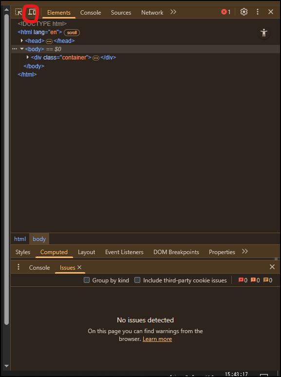
In case you’re interested, you can test how website render on phones/other devices using Chrome (or any chromium browser) Devtools’ Device tester, right here:
It’s pretty useful for web development IMO.
Also i think my browser is broken, it doesnt want to open DevTools with F12 lol
5 Likes
Haha nah your browser isn’t broken
I actually disabled the F12 shortcut on purpose . Appreciate the tip tho! I’ve used the device toggle before, super handy for testing mobile views
3 Likes