Congratulations  to all users of Infinityfree and Support Team of Infinityfree for adding new features and style to infinityfree.net.
3 Likes
Are you sure about that? Maybe check again?
4 Likes
Maybe he is talking about the new infinityfree.com
At least it was giving me a completely new look
4 Likes
I find the grey on white text @ infinityfree.com very hard to read
This again? I remember this happening before with a design. This stuff is all made by professional designers. I would expect it to not need edits afterwards to be readable.
Seriously, what is wrong with your displays? Is the contrast so bad that all content should be hard black and white to be readable?
The text is extremely easy to read on the various different screens I’ve tested.
But I suppose the text could be made a little bit darker to make it easier to read.
1 Like
I would use a tool like the one linked below to check the colors on the site. Some computer monitors and mobile device displayed render colors differently, so having a large contrast helps mitigate any changes the display might make.
https://webaim.org/resources/contrastchecker/
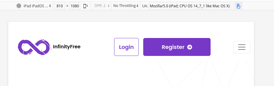
Also, and this is just my own opinion, the navbar looks a bit weird on tablet_sized displays.

The “login” button being purple automatically makes me think “This is the active page”, so I did get momentarily confused after clicking a different link and seeing the “login” link purple.
Also, again personal opinion, but login should be centered vertically, and the InfinityFree text next to the logo looks weird next to the navbar like that.
And on smaller screens, the navabar is worse:


For some reason the button to open/close the navbar jumps from the middle to the side (no animation), and the “login” and “register” button don’t become block elements like I would expect them to. (Also, the same weird thing with the login being purple).
Personally, I would move the open/close button to the right of the register button, and make it the same height as the register button, adjusting the width to match. When the navbar opens, stack the login and register buttons vertically, and animate the open/close, and make the “bars” icon into an “x” icon. Lastly, either make the login button look more like a button (Perhaps a boarder with the same radius as the register button, but no fill), or just make it black text.
4 Likes
woohoo admin seems pissed, sorry dude
maybe its my old eyes combined with crappy lcd screens , the old technology did render things better 
modern laptops with their crappy 1366x768 resolution and extreme backlight bleed are pretty crap for sure
7 Likes
I made some tweaks regarding the navbar.
On tablets, it should look right now:
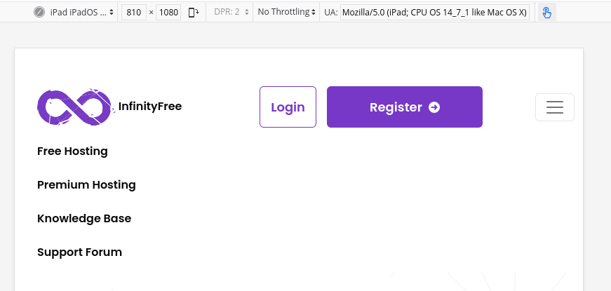
The login and register buttons are always visible and remain in place when the men is opened and closed. The login button has been edited to have an “outline” design to tell it apart from the regular menu links.
4 Likes
A couple of other points.
The padding on these is horrible:


And why is only one list item like this? Looks weird…

If you ever buy from them again, defiantly double-check over everything on a bunch of different screen sized first.
5 Likes
I don’t find it weird somehow, they both are small in length and very likely to be used together by developers.
It isn’t one, it depends on the size of your screen.
Some examples from DevTools - Nest Hub:

and iPhone SE:

I redid the features things. The bullets should now line up consistently in one or two rows, depending on the available size.
Indeed, it seems as if it was checked on desktop and on mobile, but tablet sizes were completely ignored. Lessons learned: when using Bootstrap, check the design on screen sizes of all Bootstrap breakpoints so things move on the right screen size.
6 Likes
in desktop firefox CTRL SHIFT M toggles mobile view where you can test your site with various phone and tablet models
2 Likes
This topic was automatically closed 7 days after the last reply. New replies are no longer allowed.