When creating your website, you might not think about accessibility. This can lead to a bad user experience for people who rely on accessibility tools such as screen readers. Additionally, there have been cases in the past where companies are sued for their site not being accessible and you do not want that (or I would hope so). But don’t worry, I will review some tips to improve your website’s accessibility.
Why is this important?
We must first understand why we should make our websites more accessible. Some users will use screen readers to have the items on a page read to them (poor HTML structure will lead to problems). Furthermore, some users prefer to use TAB to navigate through websites; therefore, if you do not make your website accessible, it will be a pain to anyone trying to navigate using TAB. Finally, some users might have partial blindness which would make their vision blurry. Well-structured HTML will allow partially blind users to see the hierarchy of your website with more ease.
Now let’s go over some ways to improve accessibility.
Lighthouse
Tools such as Lighthouse which are available inside of Inspect Element (developer tools) will allow you to audit your website’s weak points and strong points. You may also use PageSpeed Insights if you do not have access to Inspect Element.
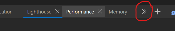
Once you open Inspect, go to the “Lighthouse” tab. If you cannot find it you may have to click the double arrow button:
The lighthouse tab should look like this:

After you have selected your options, click “Analyze page load”. Once the results load, Lighthouse will inform you of the accessibility issues that it found.
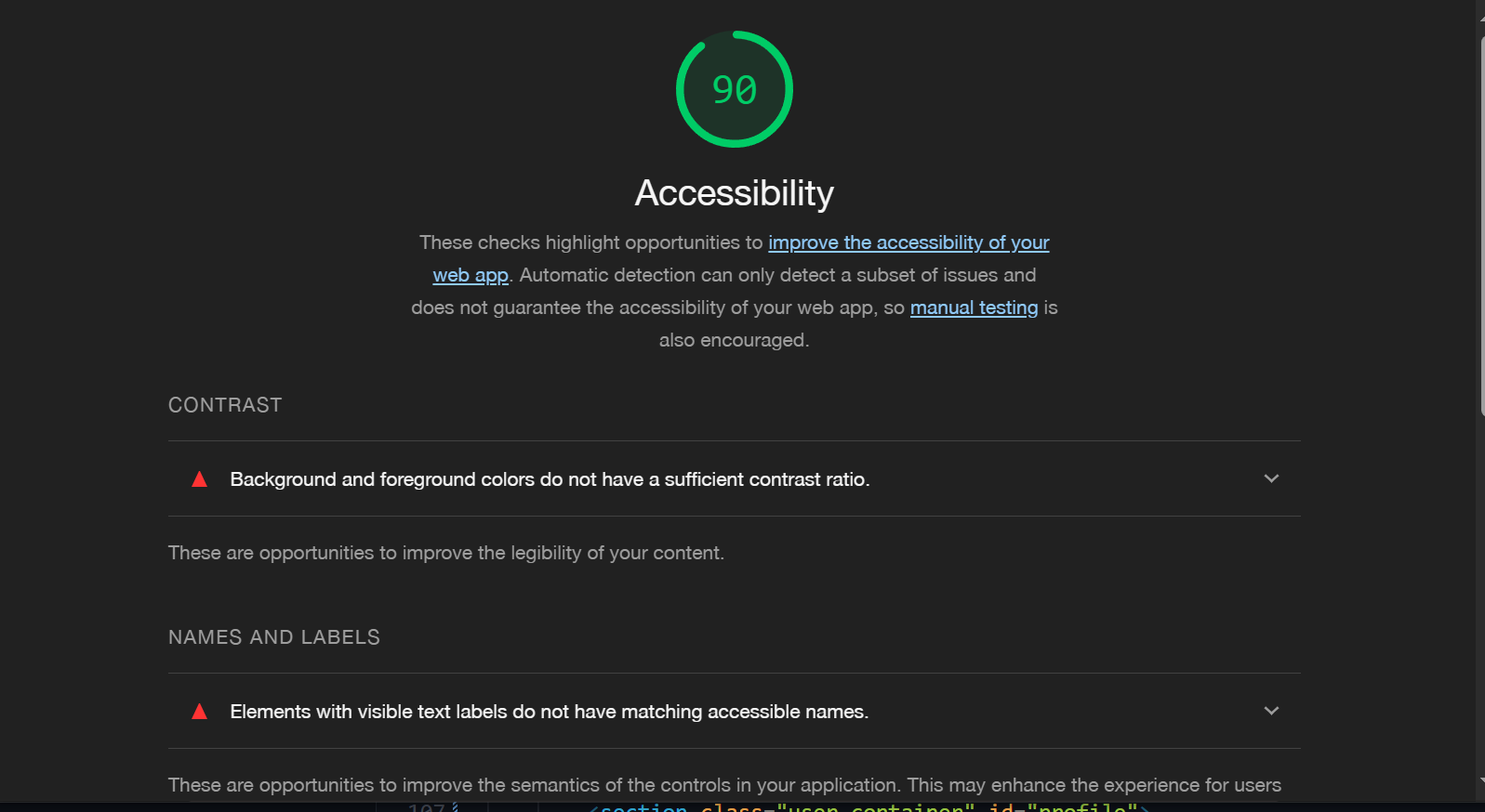
Click the down arrows for more information on the issue.

Lighthouse will automatically tell you which elements failed the audit and a link on how to fix them.
ARIA labels
ARIA (Accessible Rich Internet Applications) labels are used to give more context as to what your element does. We can use the aria-label attribute on an element to specify the context. You will mostly use aria-labels for links because if you do not, Lighthouse will mark it as a failing audit.
You may contact us on our dedicated <a href="https://example.com/contact/" aria-label="Contact page">Contact page</a>
Skip to main content
Often, your website will contain a navigation bar and it will contain a lot of elements in it. This can make it hard for people to tab through the elements. To fix this, you can add an element to your page to skip to the main content of your page.
<a href="#id-to-main-content" class="skip-link" aria-label="Skip to main content">Skip to main content</a>
When you click this element, the browser will focus your keyboard on the element #id-to-main-content. This element should usually be the first element in the body of the DOM. However, we only want this element to show when the user focuses on it with their keyboard, so we will use a bit of CSS to achieve this.
.skip-link {
  /* Position the link off-screen */
  position: absolute;
  top: 0;
  /* Position the element on the center of the screen */
  left: 50%;
  transform: translate(-50%, -101%); /* Place the element above the screen */
  border: 1px solid dodgerblue;
  background: dodgerblue;
  z-index: 999; /* Make sure it appears on top of everything */
  /* Override the regular color of <a> tags */
  color: black !important;
  padding: 0.5em;
  text-align: center;
  /* This is optional but it provides a smoother experience */
  transition: transform .3s ease-out;
  &:focus-visible { /* Focus-visible will only trigger if the user tabs to the element */
    transform: translate(-50%, 1em); /* Move the element into view */
  }
}
Here is a GIF to demonstrate the behavior:

Live demo
Code hierarchy
As mentioned before, the hierarchy of your code plays a big role in accessibility. Always remember that the DOM will be interpreted line by line. If there is an element before another element, the former will be selected first if you tab, and the latter will be selected afterward.
<a href="/page">I will be tabbed first</a>
<a href="/page2">I will be tabbed second</a>
To exclude an element from being tabbed, use tabindex="-1" on the desired element.
Blur
To simulate what a partially blind person would see if they were to visit your page, add a filter: blur(2px) to your html or body element. Increase by 2px and see if you are still able to see somewhat what the structure of your website is.

(This of course is a minimal example, your website may be a lot bigger, but you get the gist)
Color blindness
You can download the Colorblindly extension to test your website with differing color blindness settings. You might want to change the color to some elements that could be confused with another. Alternatively, have descriptive text or icons.
Contrast ratios
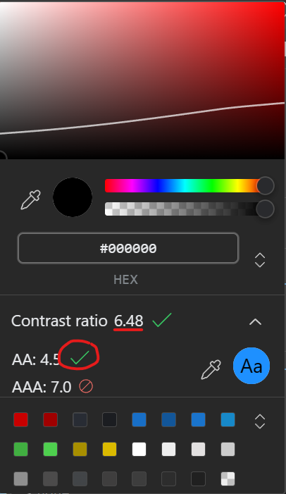
In the image I showed earlier, Lighthouse let me know that one of my elements had an insufficient contrast ratio. The contrast ratio is calculated based on the contrast between the background and foreground of an element. Developer tools can help you get a good contrast ratio score.
For example, here we have a button:
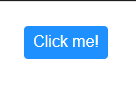
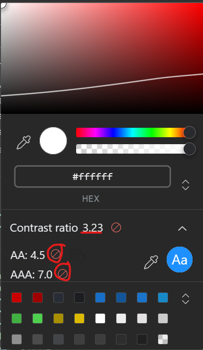
The background of the button is Dodgerblue and the foreground of the button is White. When we check developer tools to see if we are in the sufficient contrast ratio, it lets us know that we are failing both WCAG AA and AAA standards.
Read more at web.dev
Looking closely, you will see a white line running down the color picker. Everything above the line fails both standards and everything below will pass the AA standard. (Because the background color is Dodgerblue, no matter how low you go on the picker, you will not pass AAA).
When your contrast ratio is low and fails both standards, it could cause problems with people who have poor eyesight.
For instance, here we have a #fff background and the foreground is #a9a9a9. Even if you have 20/20 vision, it might be an eye-straining task to read this text.
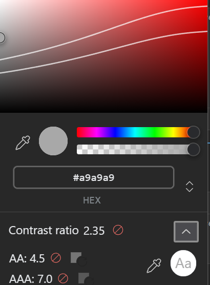
As you can see, this time there are two lines. In this case, anything between the two lines will pass AA standards and everything below the two lines will pass AAA standards.
Using semantic elements
Semantic elements are just like regular elements; however, they let things like screen readers and search engine crawlers understand the structure of your website. Instead of using a div to wrap your website, use main. If you have an article on your website, using article instead of div is better. There are other semantic elements such as section, time, header, footer, figcaption, etc. Read more at MDN.
TL;DR: Have a well-structured DOM hierarchy while using semantic elements, ARIA attributes, and have outlines when focusing on elements.
If you have any suggestions as to what I should add to this guide, please let me know!